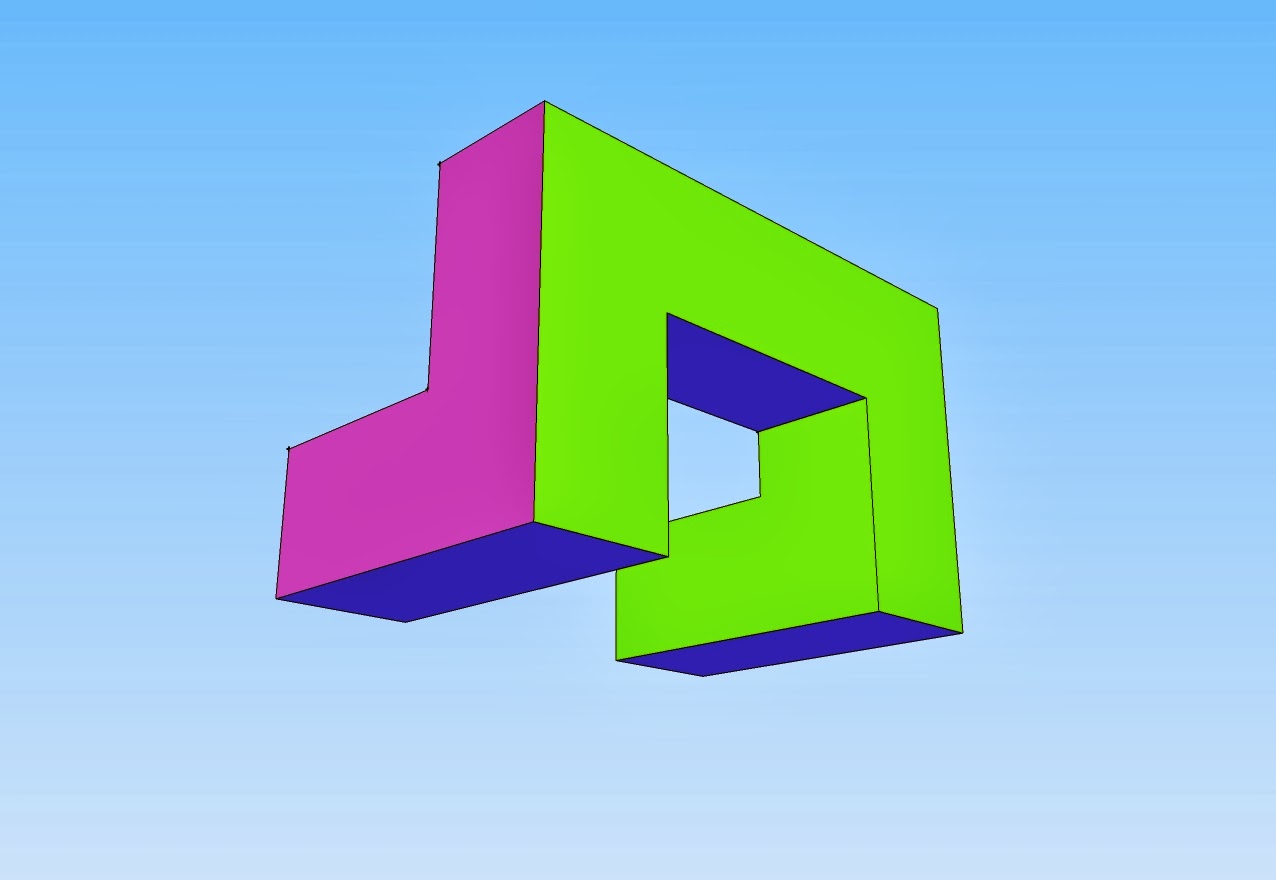
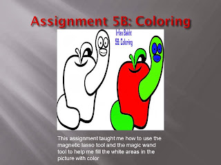
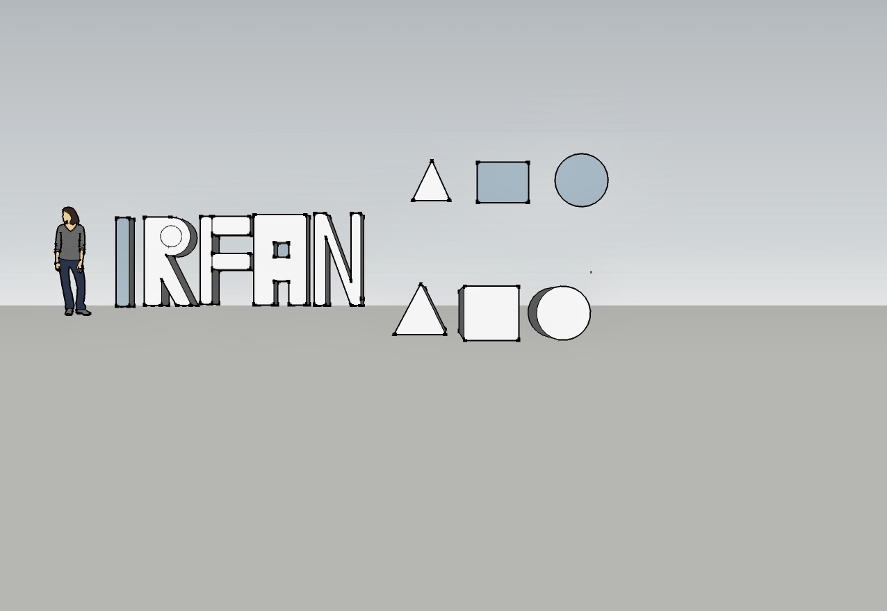
In these assignments we used Google sketch in order to make shapes and our names. We used the measuring tool in order to create the necessary dimensions of the shape, and used the push and pull tool to make the shape 3D. We used our knowledge of using Google sketch in order to create a more challenging shape/object.
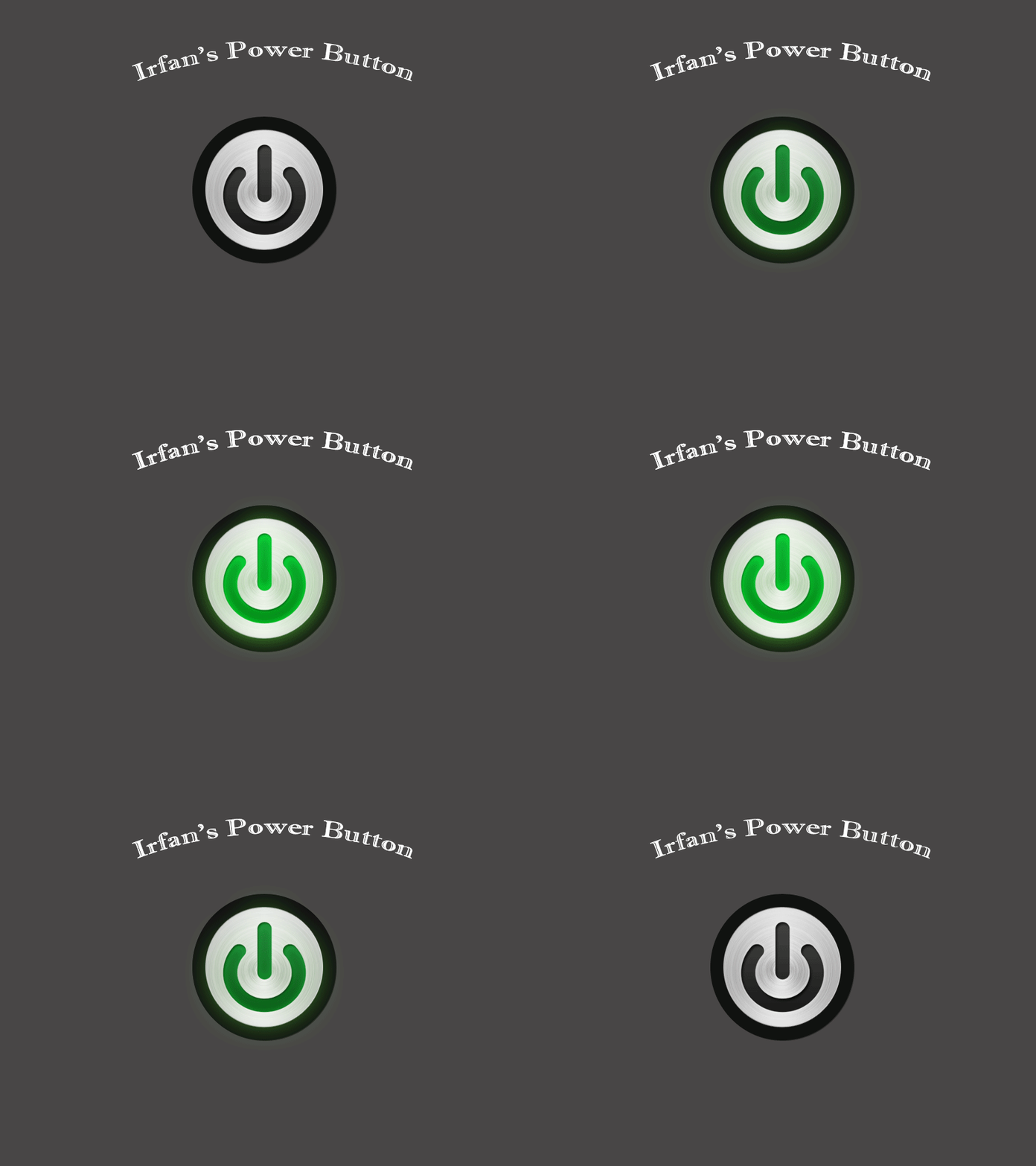
We created a gif using photoshop. We created two layers for the button in order to make it glow, one without the color green and one with it. We combined the layers using a program in Photoshop and created time lapses within between the two layers so that button gradually turns from on to off in a certain amount of time.
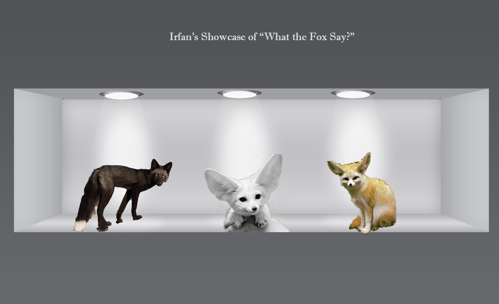
In this assignment we used Photoshop in order to create a showcase. We followed the instructions on the website in order to create the room itself. We added a sort of 3D rectangle form to the room in order to create a room that will be able to showcase objects, or in this case, animals. We cut out the animals using the magic wand tool in order to create a more smooth texture to them and displayed them under the lights we made.
Quiz: What is a Gif?
A gif is defined as a lossless format for compressing image files. A gif can either be created by compressing numerous photos in a certain time frame that will enable the end product to produce a video in a sense, and can also be created through video sniping. You can take certain parts of a video, snip them from the completed product and compress them in a program that will play that part of the video in repeat.
Multimedia Reflection:
Throughout the course of Multimedia we used numerous programs. Programs including Microsoft PowerPoint and Publisher, Google Sketch, and Adobe Photoshop. I was already quite familiar with Microsoft Photoshop and Publisher as I used them in previous years in Elementary, and Middle School so it was fairly easy navigating through those assignments. Photoshop was quite interesting for me, as all my friends would always talk about Photoshop and all the things it can be used for such as editing pictures and movies but I never really understood how difficult it could be at times. Despite having step by step instructions on how to complete an assignment, I still found some difficult to complete. Google sketch was by far my the most enjoyable program we navigated through this semester. It was sort of a load off your shoulders. At first I found it difficult to create the shapes and objects with the correct dimensions but as you get the hang of it, you're able to complete everything like one-two-three. Creating the quiz was by far my most enjoyable assignment within google sketch and my quiz shape in particular was by far one of the easiest, but also I was able to complete it without hesitation in a matter of minutes. I wish to gain perspective when going into my next elective. That everything has a certain way of being completed and that not everything can be rushed, but carefully thought through.
Throughout the course of Multimedia we used numerous programs. Programs including Microsoft PowerPoint and Publisher, Google Sketch, and Adobe Photoshop. I was already quite familiar with Microsoft Photoshop and Publisher as I used them in previous years in Elementary, and Middle School so it was fairly easy navigating through those assignments. Photoshop was quite interesting for me, as all my friends would always talk about Photoshop and all the things it can be used for such as editing pictures and movies but I never really understood how difficult it could be at times. Despite having step by step instructions on how to complete an assignment, I still found some difficult to complete. Google sketch was by far my the most enjoyable program we navigated through this semester. It was sort of a load off your shoulders. At first I found it difficult to create the shapes and objects with the correct dimensions but as you get the hang of it, you're able to complete everything like one-two-three. Creating the quiz was by far my most enjoyable assignment within google sketch and my quiz shape in particular was by far one of the easiest, but also I was able to complete it without hesitation in a matter of minutes. I wish to gain perspective when going into my next elective. That everything has a certain way of being completed and that not everything can be rushed, but carefully thought through.


